Our school is doing remote learning, like every school I know whose year hasn’t ended. With the end of this year comes urge to move past hastily planned system we have been running since March, and look forward to the fall. Most people are postponing thinking about the fall because every time the mayor or governor holds a press conference they can’t say what the fall will be. The truth is, we already have all the information we need to start planning, and the first step is in looking real hard at this remote situation that many of us our mired in. Uncertainty about next school year will loom from now until it September, and will be a constant through June. Luckily, the design of this web page can help to provide a clear idea of how to plan around uncertainty.
Web Page Designs Drastic Shift
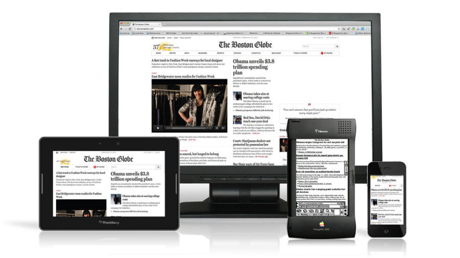
For the last decade, web designers have struggled to build websites that deliver content and look beautiful, despite companies constantly creating new devices to view the site to on. Modern websites instantaneously adapt to screen sizes as wide as a smartboard and as skinny as a smartphone. To see this in action, try experimenting with the size of this window. As you decrease the width of your browser window, the image of the 4 devices at the top stays perfectly sized for your window. Shrink it enough and you’ll notice menu icons appear. When it’s as small as the width of a smartphone screen, title of my site snuggles down next to the menu icons, conserving screen real estate, the font is easier to read, while the image at the the top still fits in the window. Websites didn’t always do this.
Comparing the ESPN website from 2010 and 2020 shows that actively adapting websites weren’t always around. Advances in technology created a litany of web-ready devices, so website developers had to build the adjustments to the big screen, the small screen, and every screen in between. Having a website solely for a full-screen computer was as typical for ESPN and other companies as the 7-period school day is for NYC educators. The consistency and predictability of web design was unmoored by Apple’s 2010 invention iPad, as neither the desktop or iphone sized sites really good on the really popular device. How they addressed the needs in these website issues maybe have some valuable lessons for schools looking to address the litany of fears surrounding this pandemic.
Adapt Respond Overcome
After COVID-19 forced a blunt introduction to remote learning this spring, schools now can expect a fall where being able to slide into remote learning is a new normal. Schools will be expected to dust off the Google Classroom and Flipgrid if next year brings a second wave, or some families decide to stay in quarantine, or an outbreak happens in school. This experiment has been difficult and unfamiliar, but likely to return in the fall if the pandemic is still going. How can you map out any calendar for the year if your school will still be in the building, remote, or doing some kind of hybrid? With vaccine deployment expected in second semester at it’s most optimistic, your school can expect to snap in to a significant portion of time. It would be nice if we could switch between the old model and this new remote thing, flexibly, right? Almost as flexibly as a … Reposnsive website?
Responsive Web Design was born a few months after the iPad in an influential blog post by Ethan Marcotte. In that post he provided an example of a responsive website that now looks standard, but was like a Back 2 The Future Guitar Solo at the time. He writes:
This is our way forward. Rather than tailoring disconnected designs to each of an ever-increasing number of web devices, we can treat them as facets of the same experience.
Wouldn’t it be great if next year could feel like one coherent experience? The news of a positive test hits your school community, in mid-October, not only does your school know how to shift the learning, but the clubs, events, and all other parts of the school experience know how to shift as well. Following some of the ideas of the web design, we could try to create a responsive school experience, in the hopes of ensuring for more equitable education in the face of these challenges.
Remote First
The first step for planning for next year should be to think through a remote learning approach that fits your values. Returning to remote learning in the fall is as appetizing as returning to that nightmare I had where I was surrounded by pirahnas. However if a second wave is remotely probably for the fall, returning to it with a plan you feel good about would be like returning to the pirahana dream, but with live preservers, or better yet a boat. Tightening up this step might involve the following:
- Reflect – How was this spring? What headaches were caused for teachers, students, parents and staff? What worked? What things were absent in a way that made you sad? For those of us (still) working in June, you may want to send out surveys, and collect artifacts to enhance your reflection.
- Tighten – Figure out ways to make the remote learning better.
- Extend – Make a plan for a whole year of remote, not just something that could work for a couple of months. Make the ship, not the lifeboat.
Planning “Remote First” is key because it has the most restrictions. The phrase “Mobile First” has been the ethos at Google since 2010 because after tackling the challenging restrictions of mobile computing there is also great opportunity for the future. Once these most challenging problems have been tackled, it is now possible to build more amazing experiences everywhere else.
These are some big remote learning questions (that I wish I had answer to, and would appreciate thoughts in the comments)?
- How do you have useful discussions?
- How can students meaningfully collaborate?
- How do you build community?
- How do you support students with special needs in all of the above?
- How can you monitor student work?
With the remote plan figured out, it is now possible to go to the opposite end and think through the completely optimistic full-year building plan. It’s not quite as simple as taking what was supposed to happen this year, since the building plan needs to avoid contradicting the remote plan. If the remote plan is using some app to build community, use it the building too. If the remote plan can’t include that super awesome hand-on project, don’t include it here. Better yet, figure out how to do remotely, update the remote plan but add the full-glory version to the building plan. Having the two plans mapped out should eventually look like two trains running on parallel tracks. This is key since there is probably going to be some jumping back and forth between trains through the year. Starting with the constraining remote plan first will ensure a coherent experience for people no matter which train they are on. Deciding when to jump trains is the reason from breakpoints.
Breakpoints
Website designers use breakpoints to define where a website needs to change for given the size of a users window. For example, if the width of this window gets smaller than than 1000px the sidebar disappears. If it gets lower than 784 the navigation changes. The breakpoints continue until at 500px the full mobile layout takes over. These breakpoints are aligned where the major device screen sizes would be and the designer made sure to plan which elements of the mobile layout and the desktop layout would be the right amount at each breakpoint.
A Breakpoint for a school might be an hybrid where some people are remote, others are in the building. For example, one positive test result could send a whole group of students into self quarantine. A breakpoint here would be helpful think through. These students’ teachers would know to move their instruction to the remote train, and in thinking through this breakpoint, maybe some letters home were drafted to communicate this to parents. A similar breakpoint could involve teachers being out on quarantine in such number that coverage is unmanageable. Then the classes can convert to computer labs, essentially, and students who are in the building can work remotely with the staff that are left. Throughout the summer and during the year, if it seems like a lot of people move between the remote plan and the building plan, it would be good to stop and think through how that would work, and call that a breakpoint.
Adapt, Respond and Overcome
The leap from old rigid websites of 2010 to the flexible ones we have now invovled lots of little steps. We still don’t have a lot of information about the way school will look in the fall, but we certainly know two ways it can look. We know what the remote learning looks like, and we can plan to make that better. We know what the building learning looks like, and we can adapt that so it is more responsive. With the two plans in hand, we can take little steps to handle whatever gets thrown our way, and in the process make our schools more adaptive and flexible.
Leave a Reply